
Can You Make the Logo…Smaller?
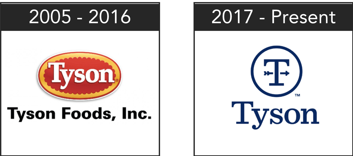 Speaking at the 2017 Consumer Analyst Group of New York, Tyson Foods President and CEO Tom Hayes talked about a new vision for the company and unveiled a dramatically new corporate logo. A stark departure from the thick white font atop a red and gold seal, the sleek “T” stands out for its simplicity and–dare I say–boringness compared to the sea of food and beverage logos out there.
Such a digression away from the original logo indicates much more than a corporate culture shift. In fact, Tyson has embraced what designers call responsive branding.
WHY IT’S HAPPENING
There is no arguing that when it comes to your brand, consistency and repetition is still incredibly important. But what has changed is how consumers interact with brands. As Matty Bruning, interactive designer at JT Mega explains:

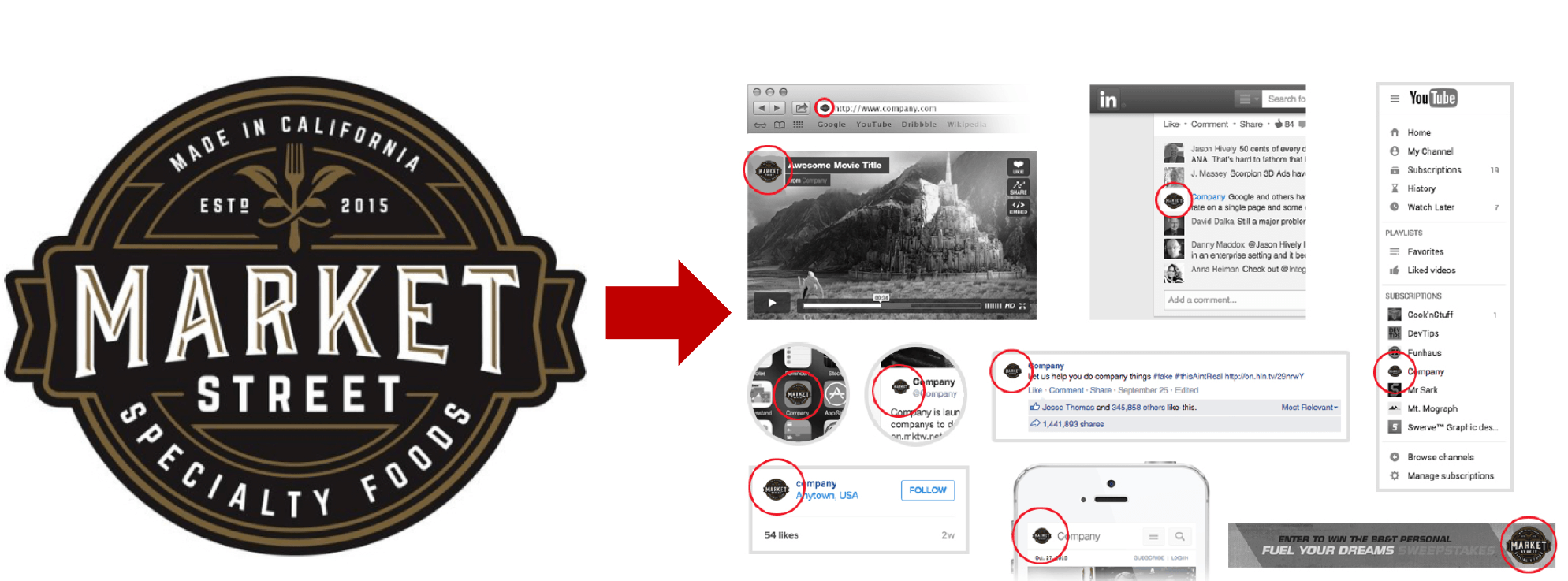
In short, the spaces our logos occupy are getting smaller and more varied thanks to an increase in technology and social platforms. Before, as the curators of our brand communications, we could be confident in our assumptions about what our brand elements would look like when appearing on printed materials, websites, billboards, etc. In the new digital ecosystem, logos get squeezed to anything from a 40 x 40 social media profile image to a 16 x 16 pixel icon on the tab of a browser window. With the proliferation of sharing on an ever growing number of platforms and devices there is no telling where or how your brand presence will display online.
The result: detailed and/or complex logo designs become unrecognizable when scaled down.
WHAT WE THINK
Both retail and foodservice companies need to proactively begin the responsive logo design process for existing brands and corporate logos.
As mobile, e-commerce and smart technology advances affect how we interact with food and beverage brands, responsive logos are needed to ensure consistent, continued brand recognition among customers. Investing in responsive logos will make it easier to adjust to shrinking screens and heightened UX demands in the future.
WHAT’S NEXT
While logos for all new brands should be approached with this new branding lens, Bruning descrbies how to approach existing logos for responsive-design:
Account for all brand experiences
Consider all the ways your audience will interact with your logo, including digital environments and device usage.
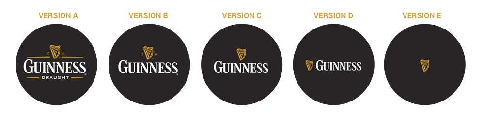
Design a logo continuum
Responsive logo design means thinking of your logo not just as a graphic, but as a system of modular components that allows you the flexibility to iterate several versions of your logo, each successively distilled until you reach the most basic yet recognizable element. This will ensure consistency across all mediums, technology platforms and devices.
Just some Thought for Food™